RIP Spreadsheets and Fishbones: Their Time Has Come and Gone
You are sitting with a group of people around a table in a conference room. On the wall, a monitor displays a spreadsheet showing the inputs and outputs of a complex manufacturing process in a vast matrix. The purpose of the meeting is to assign risk values for each input and output for the different unit operations in your process. The meeting quickly bogs down as attendees start asking about the meaning of the different risk values. What is the difference between a 3 and a 4 or a 7 and an 8? Two individuals begin debating whether a risk is medium or high. Decisions are made and justifications are written in a notebook or on a Post-it note. Then, another team member asks how to assess the risk of the outputs in this unit operation to downstream unit operations. The meeting leader states that this should be recorded in another tab of the workbook. The meeting stalls yet again when the Quality group asks for documentation and data to substantiate the selected risk levels.
For very complex processes, spreadsheets can have numerous tabs and contain large amounts of information. When the meeting wraps up, you only completed one unit operation and there are still six more to evaluate! You wake up in a sweat realizing you were dreaming...or maybe you weren’t dreaming… Unfortunately, this is the status quo and repeated at many companies around the world today. If this scenario is familiar to you, then you know that the process of risk assessment can be very frustrating and often viewed as a chore, a box to check, an exercise that does not really provide value.
In the world of pharmaceutical and medical device development, risk assessment is an integral part of the product lifecycle because manufacturing processes are too complicated to test every possible variable. Decisions on which risks are most critical to patient safety and efficacy and subsequent approaches for mitigation must be based on sound, scientific principles. Regulatory frameworks such as ICH Q8 and ICH Q9 refer frequently to risk assessment and there is an entire international standard (ISO 14971) dedicated to risk management. Furthermore, the idea of identifying, understanding and controlling risks during the development of a manufacturing process is incorporated into the quality-by-design philosophy used in many industries and now being encouraged as part of the Pharma 4.0 initiative.
There is clearly a disconnect between the regulatory expectations and the practice of risk assessment. Why does this disconnect exist? First, the tools used for risk assessment - primarily spreadsheets - are ill-equipped to handle even simple processes. Spreadsheets are designed to perform calculations on large sets of numerical data. They are best suited to visualizing relationships in two-dimensions and are not designed to manage multi-dimensional datasets. With spreadsheets, risk assessments are often constructed as a comparison of an initial risk assessment with a description of risk mitigation activities followed by a final risk assessment.
Each assessment considers all dimensions of risk (criticality, occurrence and detectability) at once and the objective is to show the risk being lowered to an acceptable level for final assessment because of successful mitigation. This construct does not follow the process development flow and is an artifact of the tool being used to manage the assessment, namely the spreadsheet.
Progressive Risk Assessment
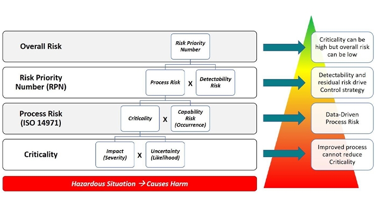
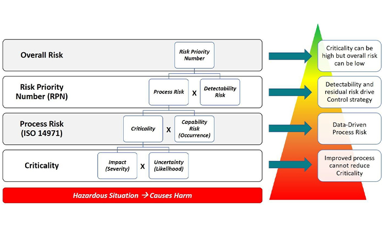
In practice, risk assessment is a progressive exercise as diagrammed in Figure 1. Risk assessments begin with the evaluation of hazardous situations that have the potential to cause harm.1 , 2 The harm could be to patients or to a downstream operation in the manufacturing process.
- 1International Standards Organization. “ISO 14971:2007: Medical devices -- Application of risk management to medical devices.” https://www.iso.org/standard/38193.html
- 2ICH Harmonised Tripartite Guideline. “Quality Risk Management Q9.”https://www.ich.org/fileadmin/Public_Web_Site/ICH_Products/Guidelines/Quality/Q9/Step4/Q9_Guideline.pdf
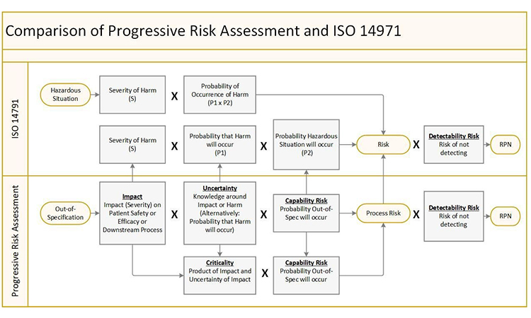
However, it can quickly get confusing due to a lack of consistency in terminology and in the definition of risk. ISO 14971 defines terms such as Severity of Harm and Probability of Occurrence of Harm while various case studies on manufacturing process development define terms such as Impact, Uncertainty, and Criticality while attempting to reconcile with Severity and Probability of Occurrence. These terms and definitions become convoluted which is a major source of frustration when trying to apply risk assessments in a consistent manner. The Progressive Risk Assessment model described here seeks to rationalize the various definitions into a consistent set that can be applied to any type of product development scenario (drug, medical device, diagnostic, etc.) while staying consistent with international standards such as ISO 14971.
The presence of risk is associated with a hazardous situation that has the potential to cause harm. The first layer of risk assessment starts with Criticality, which is the product of Impact of the harm and the Uncertainty of the harm as described in the A-Mab Case Study [3]. In the Progressive Risk Assessment model, Impact is conceptually the same as the Severity of Harm. Similarly, Uncertainty is conceptually the same as the Likelihood of Harm. So, in the lingo of ISO 14971, Criticality is the product of the Severity of Harm and the Likelihood of Harm even though this definition is not immediately apparent in the standard. The level of Uncertainty or Likelihood should be based on sound, scientific rationale.
The second layer of risk folds in the Capability Risk which is conceptually the same as the Occurrence of measured data outside the acceptable range. If measured data are frequently outside of the acceptable range, the Occurrence is high. Put another way, the risk related to the process capability is high. The product of Criticality and Occurrence provides a measure of Process Risk which is exactly the definition of risk in ISO 14971. In other words, the product of Severity and Probability of Occurrence (Likelihood * Occurrence) is exactly equal to the product of Criticality and Occurrence. This equivalence is diagrammed in Figure 2. Even though the ISO 14971 standard does not include Detectability in its discussion of risk, this final layer of risk has also been included in the comparison to yield the Risk Priority Number which is a measure of overall risk.
It is important to note that Criticality is driven by Impact (Severity) and Uncertainty (Likelihood) and is not improved by reduction in Capability Risk (Occurrence) or Detectability Risk. Better process capability which reduces the probability of an attribute or parameter being outside of the acceptable range as demonstrated by manufacturing data will reduce Process Risk. Similarly, earlier or more sensitive detection capability will reduce Detectability Risk and drive lower overall risk. With this structure, an attribute or parameter can be Critical but have low overall risk with robust process capability and control. This is the methodology used to define your design space where these attributes and parameters can vary within pre-defined limits without impacting critical quality attributes (CQAs).
Fishbones Stink
The Progressive Risk Assessment model provides a consistent structure to assess the risk of each quality attribute, material attribute, or process parameter individually. However, it does not easily show the relationship between the various input and output variables in the manufacturing process. A standard tool used in the in many industries to show these relationships is the Ishikawa or fishbone diagram. The fishbone diagram is a cause-and-effect diagram in which factors contributing to a critical quality attribute are identified and grouped by categories such as Measurements, Materials, Personnel, Environment, Methods and Equipment. The diagram in figure 3 is taken from the A-Mab Case Study in Bioprocess Development.3
- 3CMC Biotech Working Group. “A-Mab: a Case Study in Bioprocess Development.”Version 2.1, October 30, 2009. https://cdn.ymaws.com/www.casss.org/resource/resmgr/imported/A-Mab_case_study_Version_2-1.pdf
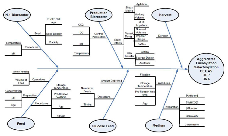
These diagrams have been used as collaboration tools to help organize information and focus discussions on selecting the inputs which may have the greatest impact on the selected output. In practice, there is no standard for grouping and this approach to diagramming cause-and-effect has numerous, considerable weaknesses.
- It can become unwieldy for a complex manufacturing process.
- The diagram groups variables by type instead of tracking the process flow from one unit operation to the next. In non-linear systems, such as pharmaceutical manufacturing, where cause and effect do not follow predictable patterns, it is necessary to have more flexible traceability from inputs to outputs.
- The fishbone construct does not easily depict the risk of each variable listed or the various layers of risk from Criticality to Overall Risk.
- The diagrams are usually created and updated manually in flowchart tool such as Microsoft Visio® and cannot easily track process evolution through the lifecycle.
Neither the spreadsheet nor the fishbone diagram is adequate to the task at hand. Each tool serves a separate function challenged in its ability to provide insight; the spreadsheet for risk assessment, the fishbone diagram for cause-and-effect. What we need instead is a new construct for visual process mapping that can elegantly provide both risk information and cause-and-effect information simultaneously.
Network Graphs
Human beings have a highly developed sense of sight and visual perception tuned to colors, shapes, sizes, and asymmetries. These aspects of human perception are described formally in psychology by Gestalt theory.4 Even with adept visual skills, humans are not designed to process large data sets as represented in rows and columns of spreadsheets.
Enter the Network Graph. In mathematics, graphs are mathematical structures used to model pairwise relations between objects. A graph in this context is made up of vertices, nodes, or points which are connected by edges, arcs, or lines.5 , 6 , 7 The graph is a perfect construct for visualizing complex systems in multiple dimensions. A node of the graph can have various shapes to represent different types of inputs or outputs. It can have different sizes to convey weight or impact and color properties to represent a current state of an object like risk. A node can be connected to one or many other nodes allowing for the visualization of complex relationships.
For example, a quality attribute for an intermediate output of a unit operation can be linked to quality attributes of intermediate outputs in multiple downstream unit operations or directly to a critical quality attribute of the drug substance or drug product. The entire graph can represent a state of the process at a particular point in time. If changes to each node are recorded over time, you can see the state of the entire process at any given point. In other words, the network graph allows you to easily visualize the evolution of your entire process.
The versatility of the network graph provides an interesting opportunity to combine the spreadsheet and the fishbone diagram into one tool where both risk and cause-and-effect can be conveyed at the same time. This combined visualization facilitates compliance with the enhanced, quality-by-design approach to product development.8 Under this approach, the development process should include a clear picture of how the patient requirements defined in the target product profile (TPP) are linked to the product requirements (CQAs) in the quality target product profile (QTPP). This picture should also show how the CQAs are linked to process requirements such as intermediate quality attributes (IQAs), material attributes (MAs) and process parameters (PPs).
- 4Wagemans J, Elder JH, Kubovy M, et al. A century of Gestalt psychology in visual perception: I. Perceptual grouping and figure-ground organization. Psychol Bull.2012;138(6):1172–1217. doi:10.1037/a0029333
- 5Bang-Jensen, Jørgen; Gutin, Gregory (2000), Digraphs: Theory, Algorithms and Applications, Springer, ISBN 1-85233-268-9
- 6Bondy, John Adrian; Murty, U. S. R. (1976), Graph Theory with Applications, North-Holland, ISBN 0-444-19451-7
- 7Diestel, Reinhard (2005), Graph Theory (3rd ed.), Springer, ISBN 3-540-26182-6
- 8ICH Harmonised Tripartite Guideline. “Pharmaceutical Development Q8(R2): Annex 1.”https://www.ich.org/fileadmin/Public_Web_Site/ICH_Products/Guidelines/Quality/Q8_R1/Step4/Q8_R2_Guideline.pdf
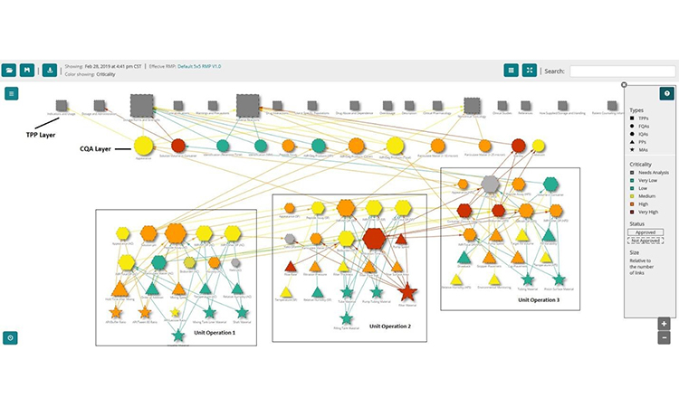
The network graph has the versatility to visualize these relationships (fig. 4) along with the risk profiles. In figure 4, the topmost layer of the graph contains the nodes representing TPP elements. The next layer shows the drug product quality attributes color-coded by risk where orange and red are critical denoting the CQAs (CQA layer). Next, the graph shows IQAs, MAs, and PPs clustered by unit operation and color-coded by risk. Finally, the lines connecting the nodes show how the various input attributes and process parameters are related to the output attributes. Visualizing these relationships is powerful and provides tremendous insight in ways that the current tools are unable to provide easily.
Filtering Multi-Dimensional Data Sets
The complexity of pharmaceutical manufacturing continues to grow with the advent of new cell and gene therapies. In tandem, spreadsheets and fishbone diagrams are growing in complexity as well. When the spreadsheet gets overloaded, people often break off from the group to create smaller sheets with just the data they need. This marks the beginning of the development of information silos. Spreadsheet applications come with filtering functions to help deal with an excess of information. However, these filters are generally limited to row and column data and cannot be easily implemented across multiple worksheets.
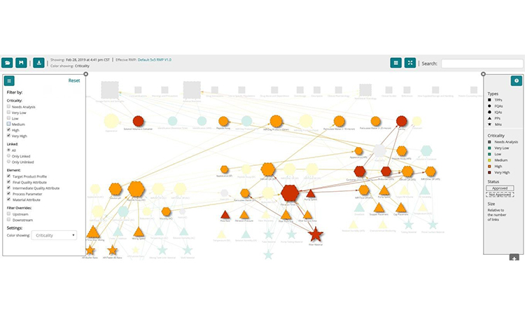
The network graph is a powerful and interactive way to simplify the visualization of multi-dimensional data sets, but it can also become visually complex. Luckily, object filtering can address this complexity and simplify visualization by allowing the selection of the dimension of interest. Perhaps there is interest in focusing only on risk and the objects which have the highest risks (fig. 5). Or the interest in a specific type of input or output attribute needs to be isolated. The filtering options are as varied as the number of dimensions in the data set (e.g. type of requirement, layers of risk, specific unit operations, the evolution of risk over time, etc.).
Process Visualization for Change Management
Network graphs function like maps that show you cities and the roads that connect them. Typing in the name of a node is similar to typing in an address and zooming in on particular information around it. This structure brings another dimension to filtering graphs. With a specific node selected, the graph can be filtered to show which inputs upstream in the manufacturing process affect the selected node. The graph can also be filtered to show which outputs downstream in the process are affected by the selected node.
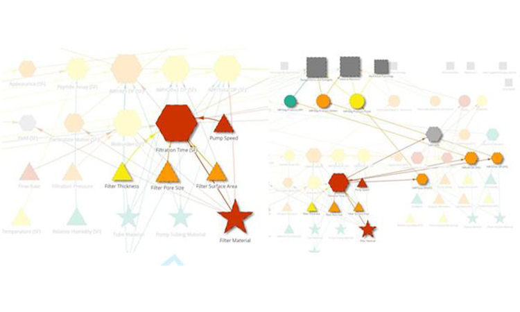
In real-world applications, visual process mapping enabled by network graphs can be very useful in root-cause investigations of deviations during the manufacturing process. For example, filtration time may be an important intermediate quality attribute of the sterile filtration unit operation in your process. If there is a deviation in filtration time, a logical place to start an investigation would be to evaluate the inputs to filtration time. Network graphs simplify the identification of these inputs. Applying an upstream filter to the parameter showing the deviation can quickly identify the inputs to the parameter that may be the source of the deviation (fig 6a). Furthermore, applying the downstream filter can help assess the impact of the deviation on the rest of the process and ultimately on patient safety and efficacy (fig 6b). With the advent of ICH Q12 and the specific guidelines discussed for managing changes to the manufacturing process, understanding the relationships between critical material attributes (CMAs), critical process parameters (CPPs) and the Established Conditions (ECs) of a manufacturing process is critical. As with deviation management, the network graph is a tool well-suited to evaluate changes to a validated manufacturing process and to justify the selected course of action based on risk and scientific rationale.
Summary
The spreadsheet and the fishbone diagram have been our faithful companions for decades now, but it is time to retire these tools for evaluating risk and functional relationships in manufacturing processes. Visual process mapping enabled by network graphs is the future of the pharmaceutical industry (and others). It is time to embrace the new tools of risk management, data-based decision making, and process understanding supported by sound, scientific rationale. Visual process mapping provides multiple constituencies (CMC, technical operations, regulatory, quality) in an organization with multivariate, relational graphs encompassing risk assessment, the filtering of multidimensional data sets, change management, root cause investigation and above all - product quality-by-design.


